MSU’s design scheme is modern, fun, and friendly. It includes versatile graphic elements that allow for various layouts while featuring repeated design concepts that create a sense of unity across pieces.
Patterns
The use of overlaid patterns creates dimension and contrast over the Minot State red.
The Primary Background Pattern is modern and youthful. The shapes can be seen as both organic and technological.

The Secondary Pattern is a more sophisticated option for our other audiences, such as parents/family, donors, and alumni.

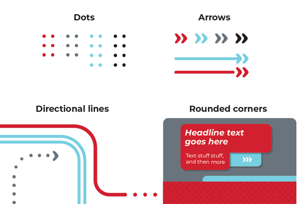
Graphic Elements
MSU has several graphic elements that work together to reflect our friendly and inviting brand.
- Our rounded corners reflect our friendly and inviting personality in a modern way.
- Dots reflect the close-knit community at Minot State. The graphics are usually featured next to key elements or messages.
- Arrows reflect a student’s continuing journey to excellence. The graphics add movement and can be used to direct the viewer’s eye around the page.